


Outbreak Outlook - National - Jan 27
Flu defies my expectations by making a comeback
Respiratory Diseases
Influenza-like illness
Edited midday Monday: FluView is now available. Official outpatient influenza-like illness data shows an increase from 5.4% to 5.7% nationwide. Children, especially those in the 5-24 age group, were behind the increases. Kids age 0-4 also saw a bump. Thirty-nine states are seeing high or very high levels of activity, spanning all four regions of the country. No new human cases of H5N1 were confirmed.
Previous update:
Outpatient influenza-like illness data was not updated this week due to the Trump Administration’s pause on health communications. While emergency department visits and test positivity data were published, I prefer to also include outpatient ILI.
To close the gap, I visited all 50 state health departments websites, and gathered what I could [edit: I just checked my spreadsheet (which is freely available here) and found that some internet citizens found a few data points that I could not find. Thank you!). This was laborious, but I am glad I did because I learned that influenza-like illness has rebounded, after several consecutive weeks of decline. This kind of rebound is unusual (but not unheard of) for this point in the season. Just last week, I wrote that I thought we would see continued improvements in flu activity. Not so.
The South and Midwest are most heavily affected, but all four regions of the country continue to see substantial flu activity. Emergency department visits, for example, have resumed increasing in the South, Midwest and Northeast. Only the Western region is seeing continued decline in that metric.

Reviewing now each region in turn, the Southeast continues to report the highest overall activity (shown below). South Carolina leads with ED visits at 8.4% and outpatient ILI at 10.8%. The coastal states from Georgia through North Carolina show consistently elevated activity, with most areas reporting increases in both ED visits and outpatient surveillance.
In the Upper Midwest, Minnesota records the nation's highest hospitalization rate at 11.6 per 100,000, along with very high ED visits at 9.6%. The sharp rise in Wisconsin's ED visits (up 57% to 6.1%) suggests that the region is still in the thick of flu season.
The Northeast shows concentrated activity along the urban corridor. New Jersey reports ED visits at 8.0% (up from 6.0%) and New York's hospitalizations have increased to 9.1 per 100,000. Activity is much lower in northern New England.
Western states are more mixed. Hawaii leads the region with ED visits at 7.0%, while California maintains steady but significant levels with hospitalizations at 6.1 per 100,000. The Mountain states generally report lower but varying levels of activity.
I hope that CDC’S FluView is published this week with the latest data, so we can get a full accounting of these trends.
COVID-19
Wastewater activity has declined to moderate levels after three weeks at high levels nationally. If activity continues to decline, this will have a been a much smaller peak in activity than during either of the other two peaks in the past year (late summer and last winter).

However, it remains to be seen whether this smaller wave will be truly be all we see this winter or if a larger wave may arrive in the next month or two.
For now, the Midwest continues to lead the country in wastewater activity, though activity has declined there for two weeks in a row, down from very high to high activity.
Looking ahead, I’m particularly watching what happens in the South and West. Activity in those regions has not increased that much in the past few weeks, unlike elsewhere in the country, meaning they may be poised for more activity in the coming weeks.

In terms of severe illness, emergency department visits have decreased slightly, down to 0.9% of all ED visits. The hospitalization rate for Covid-19 remains a bit elevated at 3.9 hospitalizations per 100,000, but has decreased for the second week in a row.

RSV
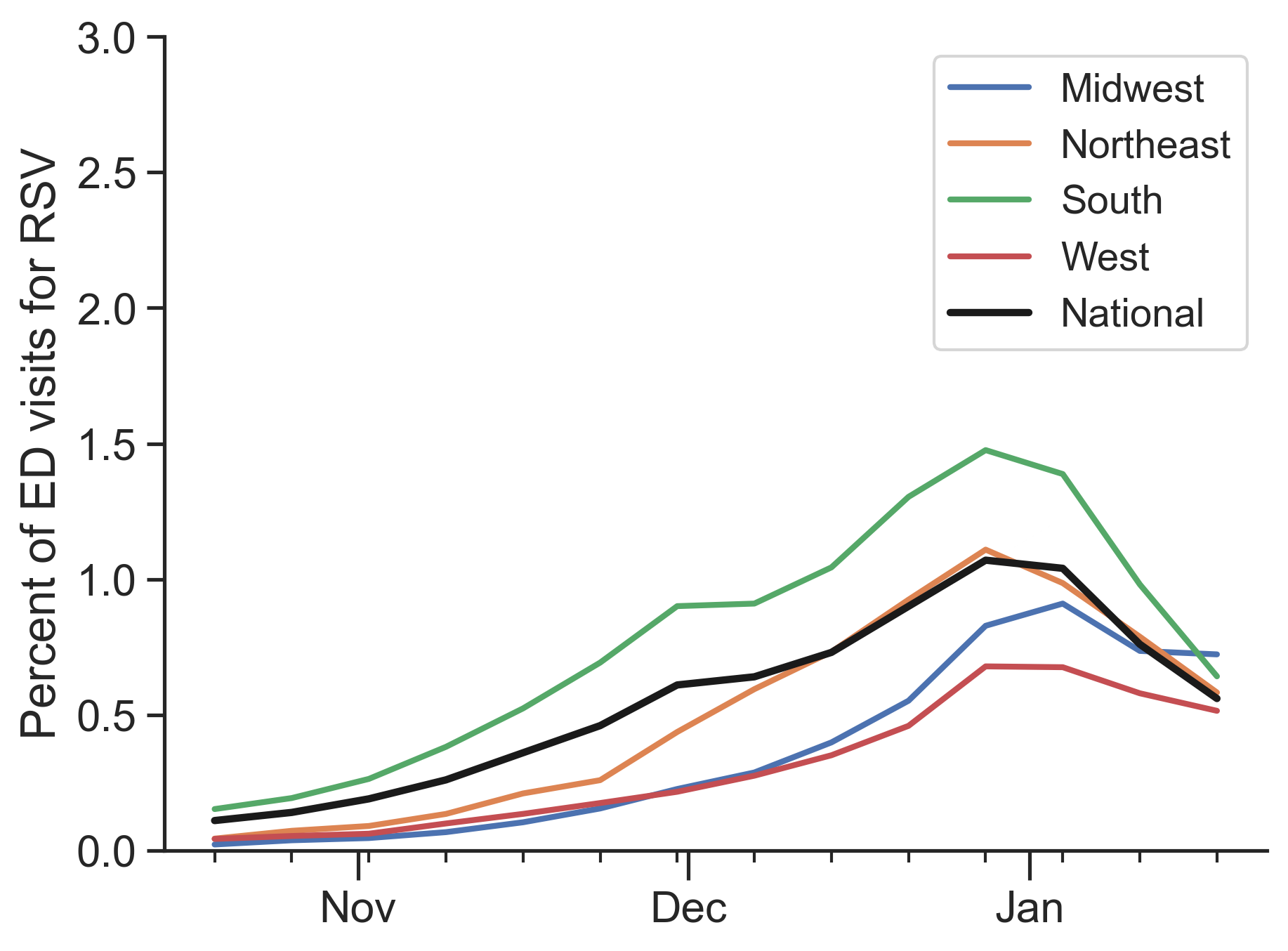
We appear to be heading out of RSV season, with all four regions of the country seeing declines in emergency department visits for RSV. However, activity is still elevated compared to the off season. I recommend continued caution if you have infants or older adults in your life.
In research news, a recent study shows that the new RSV vaccines effectively prevent RSV-related illness in adults aged 60 years and older. The study compared 146,852 vaccinated individuals with matched controls, tracking outcomes from September 2023 to March 2024. Vaccination reduced the incidence of RSV infection from 7.3 to 1.7 events per 1,000 person-years, yielding an estimated effectiveness of 78%. It also reduced RSV-associated emergency visits by 79% and hospitalizations by 80%. These findings support current vaccination recommendations for older adults and highlight the vaccine's role in mitigating RSV-related health care use during the 2023–24 season.
Norovirus
No updates. Given how high rates were last week, I expect norovirus to still be very active this week. Keep washing those hands.
Food recalls
The following foods are being recalled because they are contaminated. Please check your cupboards and throw out any of these items:
New:
Nothing new. Two recalls not related to food contamination were posted, so this is not due to lack of reporting.
Previously reported:
Casa Mamita frozen chicken and cheese taquitos (more info)
Wicklow Gold Cheddar Cheeses (more info)
Blue Ridge Beef Kitten mix [for Cats] (more info). While not for human consumption, humans may be infected with Salmonella if they do not adequately wash their hands or contaminated surfaces after handling the product.
Marketside Broccoli Florets (more info)
Connie’s Thin Crust Cheese Frozen Pizzas (more info)
If you have food allergies, you may wish to review these FDA safety alerts and USDA alerts for foods with undeclared allergens.
In other news
WELCOME — I welcomed thousands of new readers to Force of Infection last week. Quick primer if you are new here: national editions of Outbreak Outlook are published year round. In the winter, they are free. In the summer, they are available to paid subscribers. Paid subscribers also get access to winter-only regional editions, which contain information for every state. All five reports go out on Mondays. I also publish essays and other pieces on an ad-hoc basis.
The other thing I want you to know is that I wrote a book called CRISIS AVERTED: The Hidden Science of Fighting Outbreaks. It was published by Viking in October. It opens with a discussion of the World Health Organization (which the U.S. now intends to leave) and includes a chapter on the political success of PEPFAR (which is currently halted). It might help you to make sense of public health in changing times. I hope you’ll check it out.
EGG PRICES — Egg shortages and soaring prices continue across the U.S. as the avian influenza outbreak, caused by H5N1, devastates poultry farms. More than 30 million egg-laying chickens, 10% of the national flock, were culled in the past three months alone, compounding inflation-driven price increases. Wholesale egg prices have risen to $7 per dozen, up from $2.25 last fall, while empty shelves and purchase limits spark consumer panic. The outbreak, which has affected over 136 million birds since 2022, is particularly severe this season, with poultry farms in Georgia, South Dakota, and California reporting massive losses.
FEDERAL COMMUNICATIONS — A temporary freeze on public communications by federal health agencies, including the CDC, has delayed the release of important health data and publications, such as FluView and the Morbidity and Mortality Weekly Report, which was not published for the first time in decades. While some updates were released, others, including outpatient influenza-like illness and some vaccination data, was not. The Department of Health and Human Services said it imposed the pause to establish new review processes following the presidential transition. Scientists have also reported confusion over restrictions on travel, grant proposals, and other activities.
LEAVING WHO — President Trump signed a "day-one" executive order to initiate the U.S. withdrawal from the World Health Organization, a process that according to Reuters will take effect on January 22, 2026. The executive order halts future funding to the WHO, recalls U.S. personnel, and ends participation in negotiations around the Pandemic Agreement and amendments to International Health Regulations (note: the latter had already concluded when the EO was issued).
The U.S., as WHO's largest donor, has provided significant financial support, technical expertise, and leadership. Its withdrawal will likely weaken the WHO's capacity to address global health issues, including outbreak response. Domestically, this move raises concerns about the U.S.'s ability to access international health data and coordinate our response to health threats.
HIV AID — The Trump administration has halted disbursements from the President’s Emergency Plan for AIDS Relief (PEPFAR), which has provided lifesaving HIV treatment to 25 million people in 54 countries since 2003, as part of a broader review of foreign aid programs under a new executive order. The delay threatens vulnerable populations receiving U.S. aid, including disrupting HIV treatment. Though part of a larger pause on most foreign aid, the freeze casts uncertainty on PEPFAR’s future, especially following its one-year reauthorization in 2023 after surviving an earlier Republican push to end it.

Thank you again. These words seem so small and cannot possibly convey the respect and appreciation in my heart for what you have done and continue to do for us. To help us navigate life in a manner that allows us to stay as safe as possible from these types of things. As someone with chronic illnesses you’ve been a precious lifeline.
Thank you for your work! I have a suggestion, please, for your helpful graphics. I love the idea of a quick glance graphic. I do not understand the color scheme, though.
For example, orange and blue seem to signify something on top (?) and a different something below (respiratory disease by color).
It might be helpful to have dedicated colors for the “gauges” based on risk level (i.e., green for low, yellow for high), with a “dial” that matches the gauge (or if it needs to be a different color, there being some widely understood reason for the different color). Right now, I am not able to understand if orange means low or high risk level. Obviously, I am able to read the gauge to figure it out, but for me, that is despite the colors, not helped by the colors (which takes away part of the quick glance purpose of the graphic). Similarly, the colors for each respiratory disease might be helped by being distinct from threat level gauges, and/or coordinated with the 2 parts of the graphic.
Sorry, very wordy! Easier to point out when talking, if that were possible. But that is just my 2 cents for what might be helpful. Obviously YMMV, especially if it is just me that is confused. :)
Thank you again for your work!